
Beautystack Brand
As Art Director at Beautystack, I led a team to define and launch the brand visually - initially in late 2018, followed by an uplift in late 2019. Working with CEO Sharmadean Reid and Head of Brand Ellen Atlanta, we established the brand foundations and built a unique and beautiful brand identity that resonates with our core user group. We wanted Beautystack to be an industry leader in groundbreaking communication, creating content that remained ahead of the curve, empowered our users and set a benchmark for other brands.
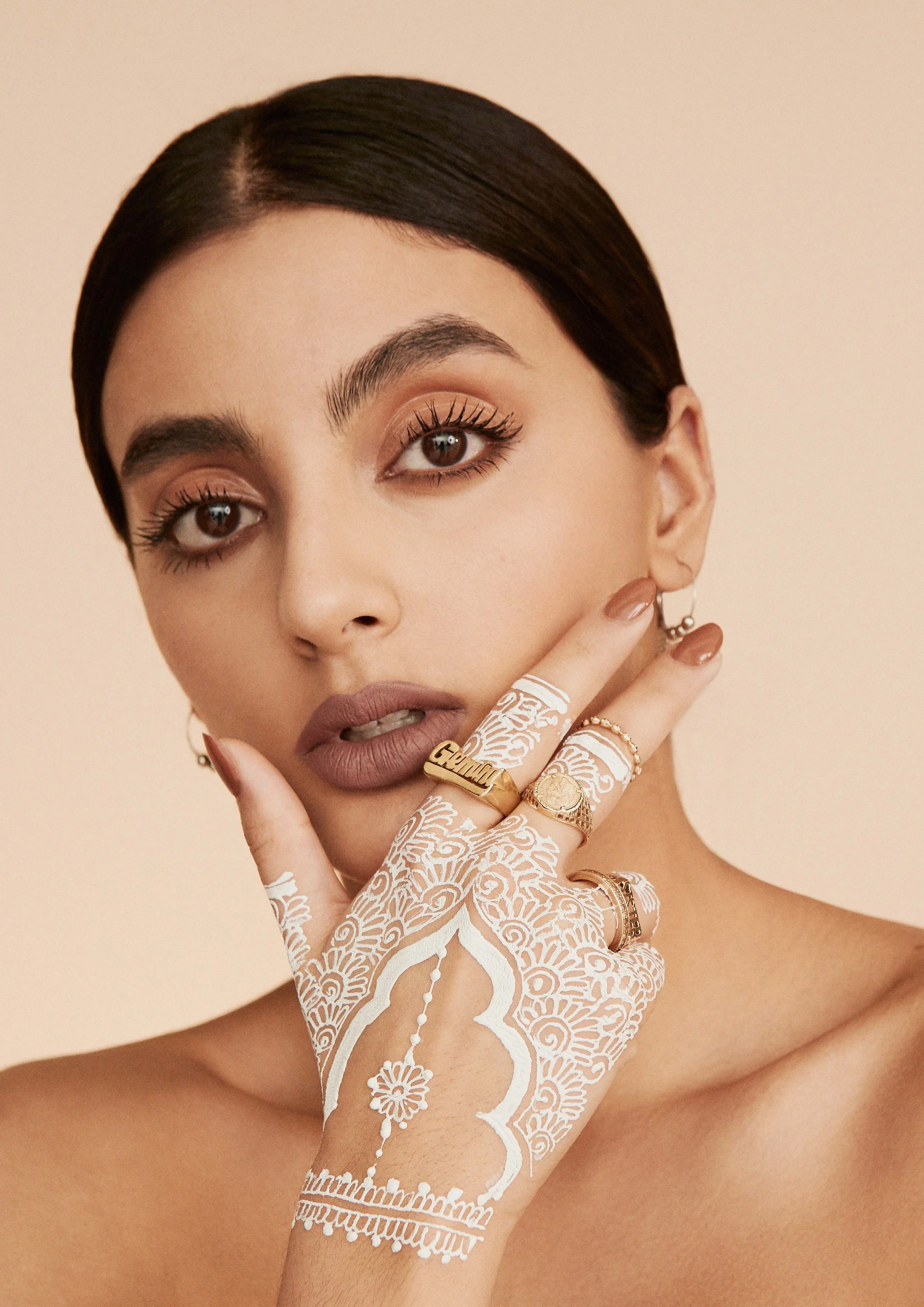
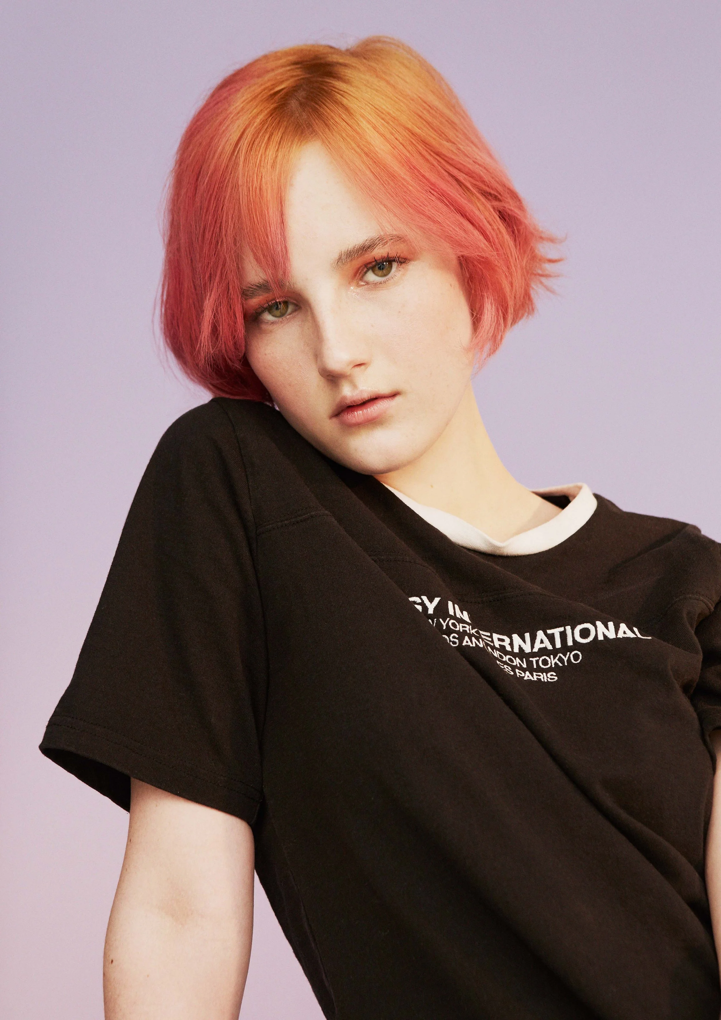
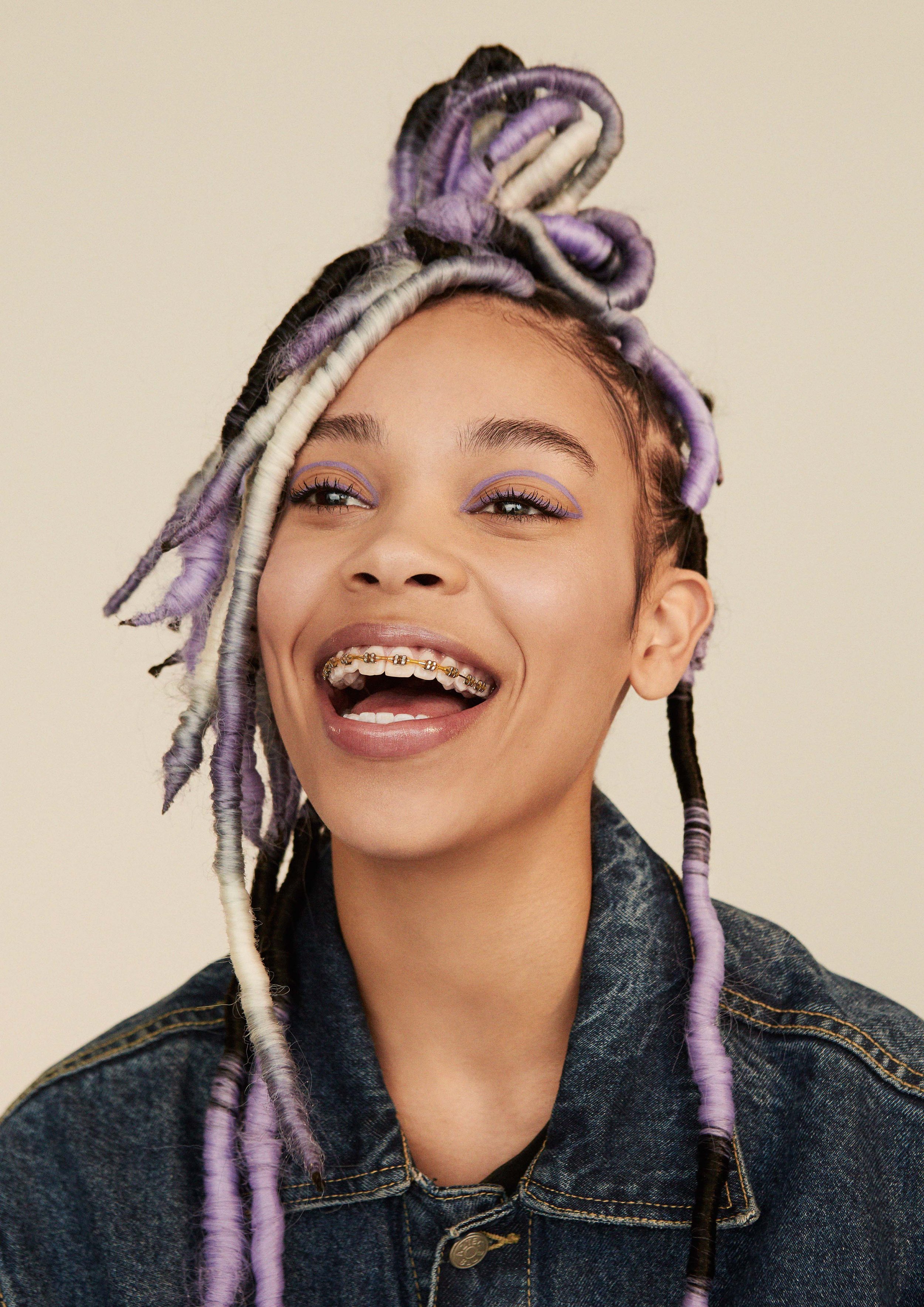
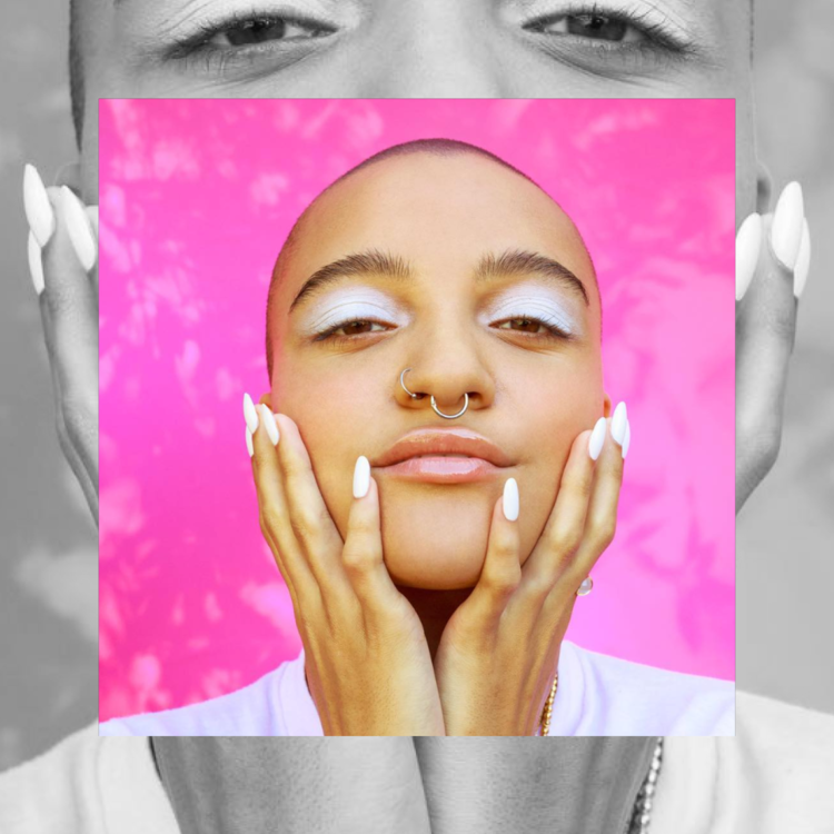
Original campaign images
Photography - Romain Duquesne
Casting - The Digital Fairy
Makeup - Gina Blondell
Hair - Naz Sonmez


Logos
Includes full logo in the signature gradient, app icon, logo mark and stamp.
Design - Rianna Osanwuta and The Digital Fairy
Colour
These are our main brand colours. The blue references the colour of a hyperlink. The blue is used sparingly to avoid overly dark designs. This colour contrasts against our fun, beauty inspired sherbet tones, which when combined form the Beautystack gradient.
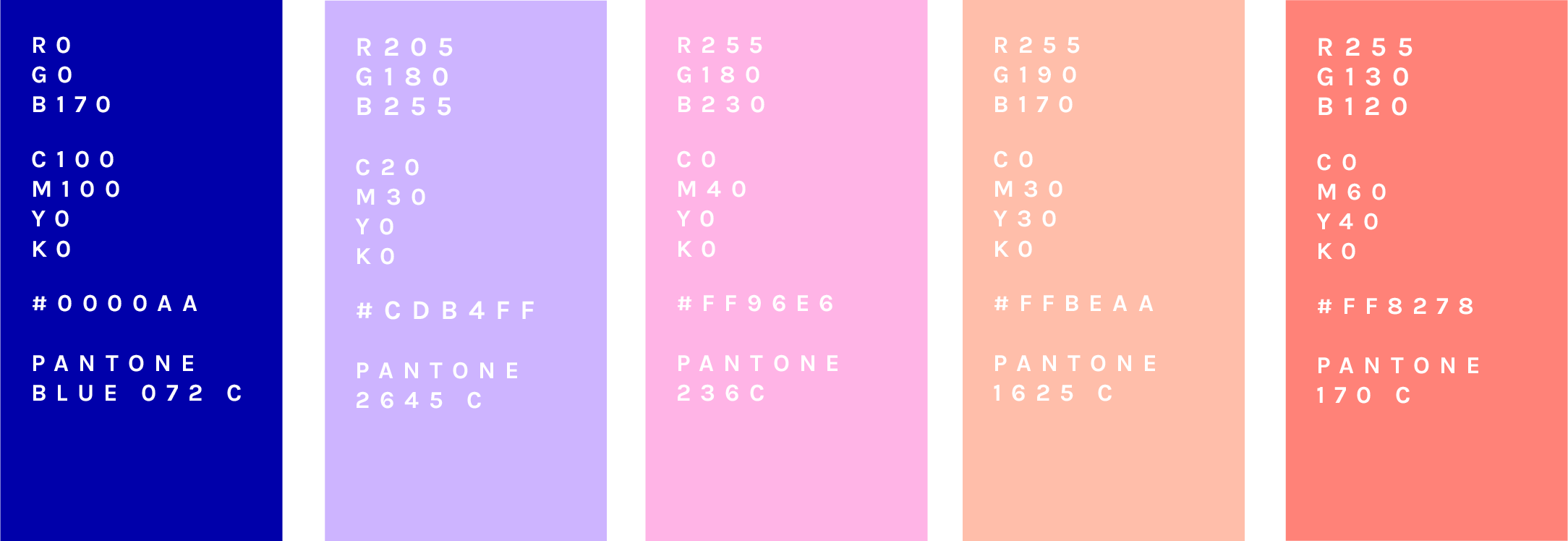


Beautystack gradient
The Beautystack gradient transcends from blue to peach at a 50% angle, from bottom left to right. Only solid white text or logos are used over the gradient.

Typography
We have a variety of fonts for different purposes
App: Karla and Canela for articles
Comms: Druk and Apercu

Druk Condensed

Druk XX Cond Super Web
Druk Wide

Apercu Medium
Karla

Canela Light
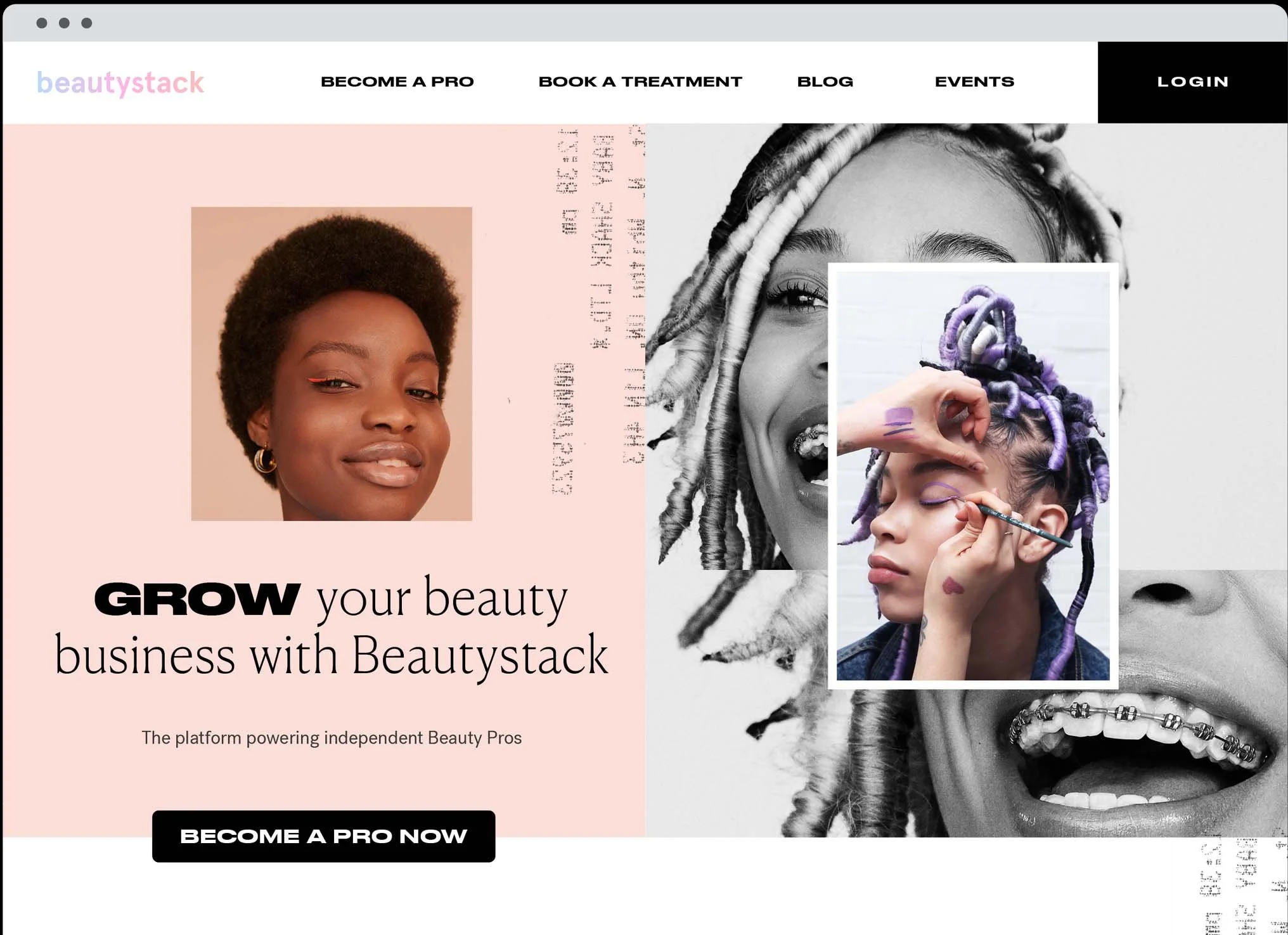
Brand Guidelines in use - in app, on social media and in mailers


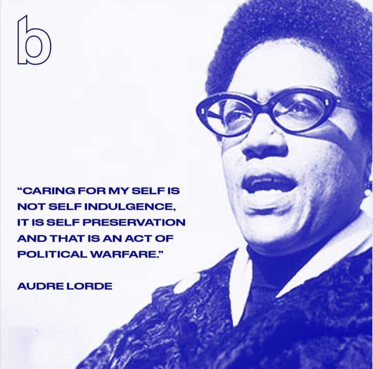
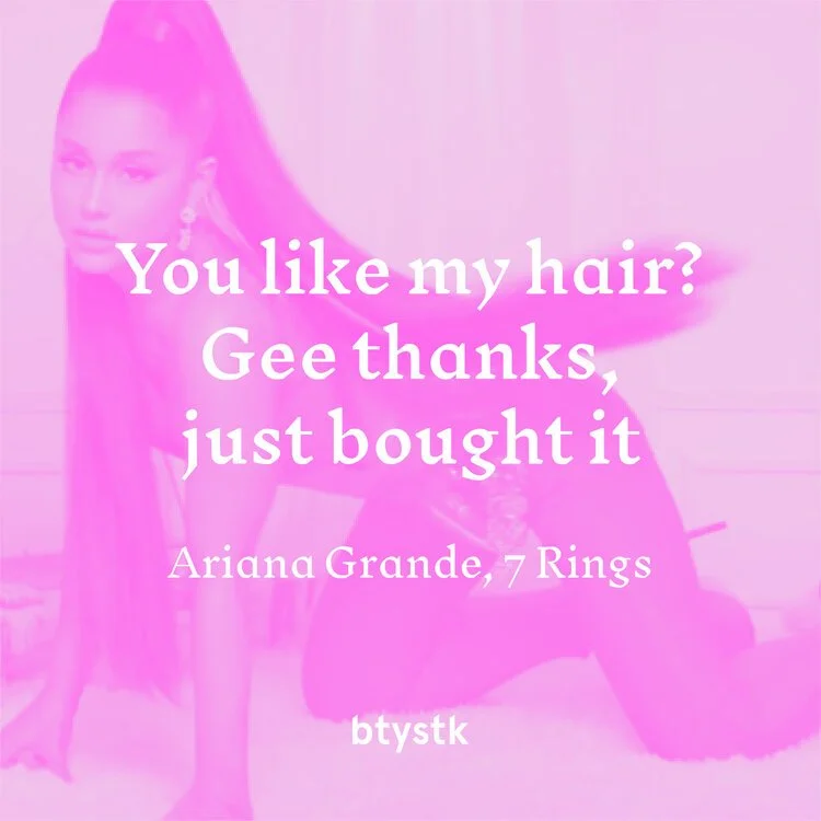
Social media graphics


Beautystack.com design features elements from our brand uplift, including a more sophisticated palette and and introduction of black.

Branding space using our signature colours
Design and signage - Rianna Osanwuta
Production and installation - Motive Productions


